
.jpg)
Categories
Selling PreparationPublished May 28, 2026
The Paint Color Question: Should You Repaint Before Listing — And If So, What Color?

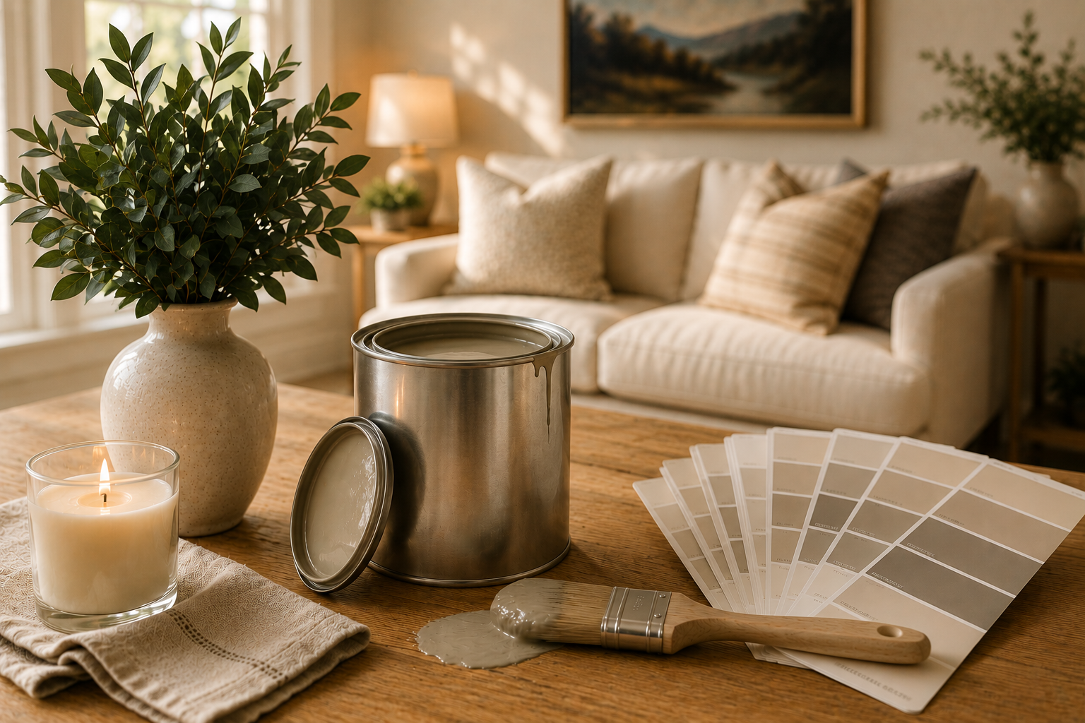
Okay, I have to be honest with you — paint might be my favorite topic when it comes to getting a home ready to list. It sounds simple. It's not always simple. But when it's done right? It is genuinely one of the most powerful, cost-effective things a seller can do before going to market.
Should You Repaint Before Listing?
In most cases — yes. Here's my rule of thumb: if your walls have scuffs, nicks, bold colors, or haven't been painted in five or more years, especially if you have kids or pets, a fresh coat before listing is almost always worth it.
Buyers make emotional decisions. They walk into a home and within the first few minutes, they're either feeling it or they're not. Fresh, clean, neutral walls create a blank canvas that allows buyers to imagine their own life in the space. Outdated or personalized colors — no matter how much you love them — can pull a buyer out of that daydream and into "project mode." And once a buyer starts mentally calculating what they'd have to change, you've lost some of that emotional momentum.
The good news? Paint is one of the most affordable updates you can make, and the return is significant. We're talking about a few thousand dollars — sometimes less — that can make your home feel completely refreshed and move-in ready to buyers across every price point.
What Colors Actually Work?
This is where I get really specific, because "just paint it neutral" is vague advice. There's a big difference between a warm neutral and a cool neutral, and the wrong choice for your home's lighting, flooring, and finishes can actually work against you.
My go-to brand recommendation? Sherwin-Williams. Their colors are consistent, their coverage is excellent, and their warm whites and soft neutrals are some of the most buyer-friendly shades on the market right now, and most painters use there products. The gray-heavy palette that dominated a few years ago has shifted — today's buyers are responding to warmer, creamier tones that feel inviting, timeless, and move-in ready. Here are our current favorites:
Alabaster (SW 7008) - The Warm Classic
Alabaster is one of the most universally flattering paint colors you can put in a home, and it is a go-to recommendation for us across a wide range of listings. It reads as a soft, creamy off-white with warm yellow undertones — meaning it never feels cold, stark, or clinical. It makes spaces feel bright and airy while still wrapping a room in warmth.
Alabaster shines beautifully in homes with warm wood floors, natural wood cabinetry, or warm-toned stone countertops. The yellow and beige undertones in Alabaster echo those warm finishes rather than fighting them, creating a cohesive, harmonious look throughout the home. If your home has a lot of wood detail — exposed beams, hardwood floors, wooden cabinetry — Alabaster is often our first recommendation.
Pure White (SW 7005) - Clean, Crisp, & Versatile
Pure White is the great balancer. It is brighter and cleaner than Alabaster but still has just enough warmth to keep it from reading harsh or cold. It works beautifully as a wall color in homes with cooler-toned finishes — think light gray tile, cool quartz countertops, or white oak flooring — where Alabaster's creamier undertones might feel slightly off.
Pure White is also our top pick for trim, doors, and ceilings when you want a clean, polished contrast against a slightly warmer wall color. Paired with Alabaster or Natural Choice walls, Pure White trim creates that fresh, magazine-ready look buyers love without feeling cold or sterile.
Natural Choice (SW 7011) - The Effortless Neutral
Natural Choice is a beautifully balanced warm white with subtle beige undertones — sitting comfortably between Alabaster and a true neutral. It reads as clean and fresh without ever feeling cool or gray, which makes it incredibly versatile across a wide variety of home styles.
This is an especially strong choice for homes with mixed finishes — perhaps warm wood floors in the living areas but cooler tile in the kitchen or bathrooms. Natural Choice bridges those transitions gracefully because its undertones are neither strongly warm nor cool. It is a true crowd-pleaser that photographs beautifully and feels effortless in person.
Aesthetic White (SW 7035) - The Color Drenching Favorite
If your thinking about painting walls, trim, and ceiling all the same color — a technique called color drenching that is having a real moment right now — Aesthetic White is the color we reach for first. Here is why: it is warm enough to feel cozy and intentional, but light enough that it does not feel heavy or cave-like when used throughout an entire space, ceiling included.
Pure White can feel a bit too bright and almost clinical when used on every surface at once — it starts to read more like a hospital room than a designer space. On the other end, going too deep with a warmer cream can make a room feel smaller and darker when the ceiling matches the walls. Aesthetic White hits that perfect middle ground. When you drench a room in Aesthetic White — walls, trim, doors, ceiling, all one tone — the result is effortlessly elegant, architectural, and very on-trend right now in the Southlake and Argyle markets.
Dover White (SW 6385) - Soft, Timeless & Traditional
Dover White has a soft, antique quality to it — a warm white with very subtle gray-green undertones that give it a timeless, almost historic elegance. It is a beautiful choice for more traditionally styled homes, homes with classic architectural details like crown molding and wainscoting, or any listing where you want the walls to feel refined and gently sophisticated rather than crisp and modern.
Dover White pairs exceptionally well with natural stone, brick accents, and rich wood tones — which makes it a standout choice for many of the traditional and transitional homes we work with in Argyle and Bartonville.
Neutral Ground ( SW 7568) - The Warm Greige
Neutral Ground is where we turn when a seller's home has warm, golden undertones throughout — honey-toned hardwood floors, warm cabinetry, bronze or gold fixtures — and a stark white would feel disconnected from those finishes. It is a warm greige that leans creamy and light, never muddy or heavy, and it photographs with a beautiful softness that reads as genuinely inviting.
Think of Neutral Ground as the color that makes a warm, cozy home feel intentionally designed rather than simply dated. It honors the warmth of the existing finishes rather than fighting them — which is exactly the right strategy when you want buyers to walk in and feel at home immediately.
Snowbound (SW 7004) - Light, Airy & Fresh
Snowbound is a soft, barely-there white with very light gray undertones — and it is one of our favorites for homes that get a lot of natural light or have a more contemporary, clean-lined aesthetic. Unlike a bright white, Snowbound does not bounce harsh light around a room. Instead it absorbs it gently, giving the space a serene, spa-like quality.
Snowbound is a particularly strong choice for homes with cooler-toned finishes — white oak flooring, cool gray tile, silver or chrome fixtures — where warmer whites like Alabaster or Natural Choice might pull slightly yellow by contrast. It is fresh, calming, and feels very current without leaning into the dated gray palette that has largely run its course.
A Note on Painting Walls, Trim & Ceiling the Same Color
We are getting this question more and more from sellers lately, and it is a great one. Color drenching — painting your walls, trim, doors, and ceiling all in the same tone — is having a real design moment right now, and when done correctly, it looks absolutely stunning in listing photos and in person.
The key is choosing the right white. If you go too bright — like a stark, clean white — the result can feel cold and institutional, especially when every surface is the same tone. Too much brightness with no variation reads as harsh rather than polished. On the other end, if the color is too creamy or deep, drenching can make a room feel smaller and heavier than intended.
Our recommendation for color drenching? Aesthetic White (SW 7035). It is warm enough to feel intentional and cozy, light enough to keep the space feeling open and bright, and it has just enough complexity that it does not read as flat or sterile when repeated on every surface. The result is a room that feels architecturally cohesive — like the space was designed that way — which is exactly the impression you want buyers to have.
Pro Tips From the Listing Coordinator
Sample first, always — and use the right sampling tool.
Colors look completely different on a wall than on a chip or a screen, and this is the step most sellers skip.
Sherwin-Williams offers two great options here. The first is their small sample jars — you can grab one for just a few dollars, paint a generous swatch directly on your wall, and live with it for a day or two before committing. The second option — and one I love recommending — is their peel-and-stick color swatches. These are large, repositionable adhesive squares in the actual paint color that you can stick directly onto your wall, move from room to room, and peel off cleanly without any mess or commitment. They are perfect for comparing multiple colors side by side, and they are especially helpful if your walls are already a dark or bold color that would affect how a small painted swatch reads. Either way, look at your samples at different times of day — morning light, midday, and evening lamp light — before making your final call.
Consider your lighting.
North-facing rooms get cooler, bluer light — lean toward warmer tones like Alabaster, Natural Choice, or Neutral Ground. South-facing rooms get warm golden light all day and can handle slightly cooler options like Snowbound or Pure White without reading cold.
Don't forget the ceilings.
A fresh white ceiling makes everything feel taller, cleaner, and more finished. Buyers might not consciously notice it — but they absolutely feel it.
Consistency matters.
A cohesive, whole-home neutral palette makes your home feel larger, more intentional, and much easier to photograph. Different colors in every room can make spaces feel choppy and disconnected.
The Bottom Line
Repainting before you list isn't about erasing your personal style — it's about making space for a buyer to picture theirs. The right warm white from Sherwin-Williams does exactly that. It's inviting without being boring, fresh without feeling cold, and it tells a buyer: this home has been cared for.
At the Gina Mullen Realty Group, paint choices are part of the strategic listing plan we build for every seller. We know what buyers in Argyle, Southlake, and the surrounding DFW communities are responding to right now — and we're here to make sure your home speaks their language from the moment they see it online.
Ready to get your home market-ready? Let's talk about where to start.

Gina Mullen
Luxury REALTOR®, Team Owner | Gina Mullen Realty | Real Broker LLC
or another way